


Brand Style Guide
A big part of who we are as University of Idaho is how we look. The colors we use and the way we represent our institution through logos and graphics combine to create a visual identity that helps U of I stick in the minds and hearts of our audience.
Color Identity
Primary Colors
Color is a critical institutional identifier. Gold, Silver, Black and White are the primary colors for the University of Idaho.
Our main gold is Pride Gold. This vibrant color helps U of I’s materials stand out and have strong visual appeal.
Pride Gold
Pantone 3514 C
CMYK 0-27-100-0
RGB 241-179-0
#F1B300
Silver
CMYK 0-0-0-50
RGB 128-128-128
#808080
White
CMYK 0-0-0-0
RGB 255-255-255
#FFFFFF
Black
CMYK 20-20-20-100
RGB 25-25-25
#191919
Metallic Gold
Special uses only
Consult with Creative Services
Tertiary Colors
An accent color palette has been developed to add depth and flexibility to the university’s primary color palette. For more information on tertiary colors and their uses, refer to Brand Style Guide.
Official University Logos
The University of Idaho logomark — which includes the “University of Idaho” wordmark and the “I” — is a powerful symbol of our great university.
The university’s logos and graphics are registered trademarks and should not be altered. We do not permit the development or use of alternate logos.
The vertically stacked wordmark is the preferred orientation, horizontal options are available.
The University of Idaho wordmark should never appear alone (always with the “I”), but the “I” may sometimes be used alone as a graphic element with special permission.
Logo Clear Space Requirements
Always separate the U of I logo from other accompanying text and graphic elements by a minimum specified distance of clear space. The distance of clear space is defined by the height of the lowercase “v” letter in the wordmark.
“I” Usage
The “I” symbol may only be used alone without the wordmark when explicitly approved or allowed. Refer to U of I Brand Style Guide for more information.
Logo Usage
Altering the logo can cause misunderstanding and confusion about the brand. Altering or obscuring the logo in any way is not permitted.
Do not move or remove logo elements.
Do not show the logo in colors other than the official logo colors specified in this guide.
Do not position logo at an angle.
Do not distort the logo.
Do not alter the "I" symbol.
Do not use the wordmark without the "I" symbol.
Do not typeset the wordmark.
Do not place the logo on a distracting background.
Do not place a drop shadow on the logo.
Do not encroach on the clear space requirements detailed above.
Unit Logos
Logos are created for the university’s main campus and three educational centers, each college, and academic department, offices/units, Extension and research centers.
Programs or offices without their own logo should use the logo of their overseeing unit. A unit without a logo may request a graphic mark that must always be properly used in conjunction with the U of I main logo following all clear space guidelines.
Co-Branding
In some instances, materials are co-branded to show a collaboration between two U of I units or a partnership between U of I and external organizations (e.g. a conference flyer). Follow these guidelines when two logos are used in the same design:
- Co-branded logos must be the same size.
- All units/brands need to be represented equally.
- Color usage should be 50/50. If the colors don’t work together or could be interpreted as another organization’s brand, use neutral colors, such as black and white.
- National program brands (NASA, NSF, etc.) supersede U of I’s core brand.
University Seal
The university seal is reserved for business, legal and invitational communications, awards and diplomas. The use of the university seal is restricted to discretionary use by the Office of the President and the Board of Trustees.
The approved color options for the seal in general usage are Black or Metallic Gold. The use of gold foil is also permitted as a print method for the seal.
Metallic Gold Seal
Black and White Seal
Reverse White or Foil Seal
Downloadable versions of the standard U of I logos for colleges, departments, centers and UI Extension offices are also available in the Brand Toolkit.
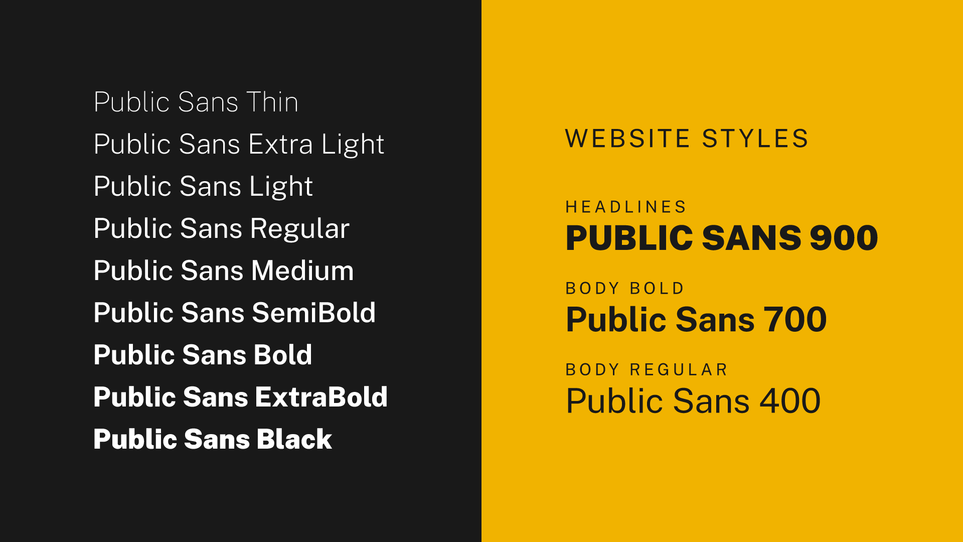
Typography
Primary Typeface
A primary typeface has been chosen to nurture design cleanliness and consistency across all communications. Our primary typeface is Public Sans.

Secondary Typeface
A secondary typeface establishes hierarchy to headlines and body copy. This is particularly important when there is a lot of copy. Our secondary typeface is Gintronic. Contact marketing@uidaho.edu to access Gintronic and discuss usage of the secondary font.
Photography
Photography and videography are major ways that we visually tell the story of the University of Idaho. For guidelines regarding elements of our photographic style, including point of view, setups, mood, lighting, community, events and composition, download the U of I Brand Style Guide.
Ancillary Graphics
In addition to our logomark, the University of Idaho has several ancillary graphics that support the brand, including patterns and icons. Please contact the Creative Services team at 208-885-6293 or email the Marketing team at marketing@uidaho.edu with any questions about use. You can find all approved ancillary graphics in the U of I Brand Style Guide.
Ordering Promo Products
Promotional items market your college, department, program or event in a great way. U of I partners with a select group of approved licensed vendors, including the VandalStore, who are experienced at creating branded promotional products. These vendors can help you create a product design within U of I brand guidelines.
U of I logos and brand graphics are registered trademarks. Use of these trademarks on products require prior approval from the U of I Office of Trademark and Licensing. Royalties are subject to use of registered trademarks.
How to Use the Brand on Products
Do
- Use approved licensees. Check our list of licensed vendors to ensure the company is authorized to sell products with the University of Idaho name.
- Complete the Merchandise Order Form.
- Review the university’s promotional use policy.
- Follow U of I brand visual style guidelines for logo usage, colors, typography and other design elements.
- Email the Office of Trademark and Licensing for approval of artwork prior to ordering product.
- Ask the approved vendor for product samples prior to submitting a full order.
Don’t
- Alter any of the university’s trademarks, including logos and graphic elements.
- Use the university’s brand on any products that may be harmful to the image or mission of the university.
- Don’t assign trademark usage rights or otherwise grant permission to any other internal or external entity for any purpose without prior review and approval by the Office of Trademark and Licensing.